matplotlibのpyplot APIをいろいろ試す
matplotlibはpythonでデータの可視化をするときに重宝しますが、ドキュメントがパッと見わかりにくいので、取っ掛かりが難しいです。
たまにデータの可視化をするのですが、 matplotlibの調べ物に時間がかかるときがあり「なんか時間がもったいないな」と感じていました。
今回はmatplotlibのドキュメントを読みつつ、matplotlibのpyplot APIをいろいろ試し、自分向けにまとめました。
実行環境
実行環境は以下になります。
- mac OS (High Sierra 10.13)
- Python 3.6.1
- matplotlib 2.2.2
- jupyter 1.0.0
- numpy 1.14.5
- pandas 0.23.1
また、今回作成したグラフは こちら にpushしてあります。
pyplotの思想を理解する
グラフ描画を始める前にpyplotの思想を理解しました。
いきなりSample Garallyから行くと凝ったグラフが出てきて理解が追いつかなくなるので注意が必要です。
探しにくいですが、公式の Usage GuideのGeneral Conceptsの項 にpyplotの概念の説明があるので一読しました。
プロットできるデータの種類
matplotlib.pyplot モジュールがデータのプロット(描画)を司るモジュールになります。
matplotlibのpyplotのページ に提供しているAPIの一覧記載があるのでそれを参考に試していきます。
ここでは、大きくわけて以下2種類を取り扱います。
- グラフの種類を指定する関数(棒グラフや円グラフなど)
- 渡されたデータに対して、特定の演算結果を描画する関数(スペクトル計算など)
棒グラフ(積み上げ棒グラフ):bar/barh/broken_barh
棒グラフ を描画します。 xerr yerr オプションを指定すると誤差の指定ができます。
1import numpy as np
2from matplotlib import pyplot as plt
3
4x =  np.arange(5)
5y = (1, 2, 3, 4, 5)
6width = 0.3
7yerr = (.1, .08, .1, .0, .5)
8
9plt.bar(x, y, width, align='center', yerr=yerr, ecolor='r')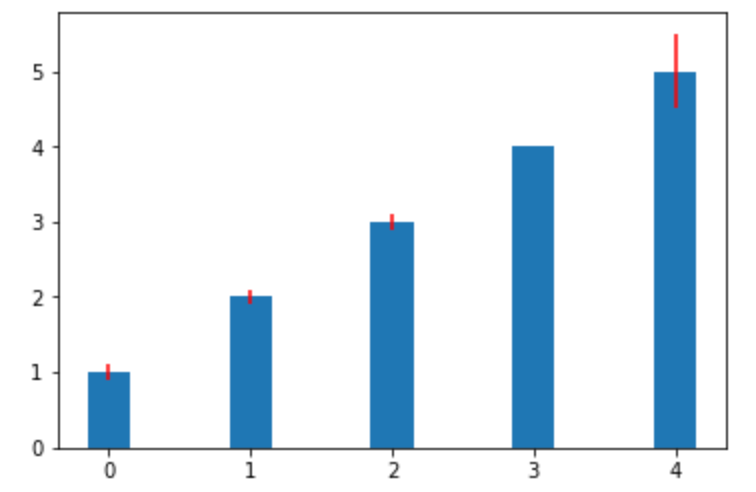
bottom オプションで積み上げておきたい初期値を設定することで、 積み上げ棒グラフ を描画することもできます。
積み上げるグラフの複数の配列の要素数は同一である必要があり、bottom 指定を忘れると、2種類の棒グラフを重ねて描画してしまうので注意が必要です。
 1import numpy as np
 2from matplotlib import pyplot as plt
 3
 4x =  np.arange(5)
 5y = (1, 2, 3, 4, 5)
 6y2 = (2, 1, 3, 2, 1)
 7width = 0.3
 8yerr = (.1, .08, .1, .0, .5)
 9
10p1 = plt.bar(x, y, width, align='center', yerr=yerr, ecolor='r')
11p2 = plt.bar(x, y2, width, align='center', bottom=y, yerr=yerr, ecolor='r')
12
13plt.show()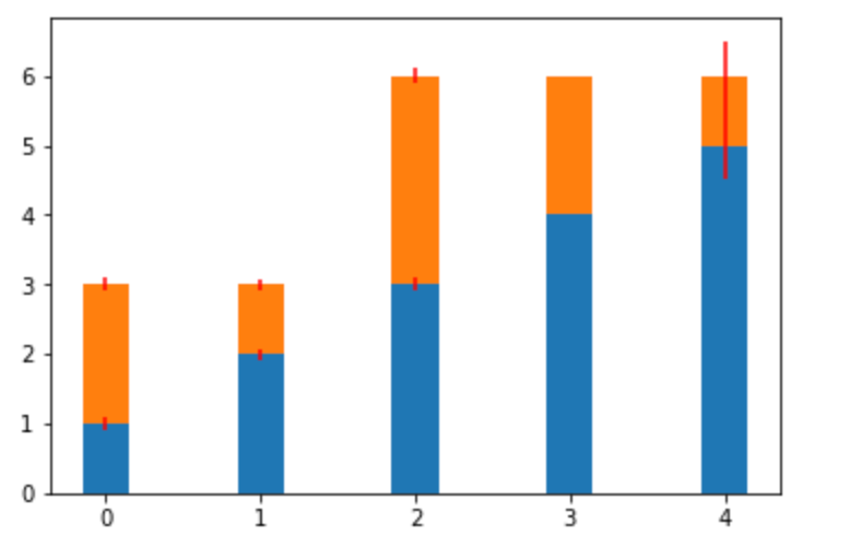
y軸から横に伸びる棒グラフ は barh 関数を使います。
1import numpy as np
2from matplotlib import pyplot as plt
3
4x =  np.arange(5)
5y = (1, 2, 3, 4, 5)
6width = 0.3
7xerr = (.1, .08, .1, .0, .5)
8
9plt.barh(x, y, width, align='center', xerr=xerr, ecolor='r')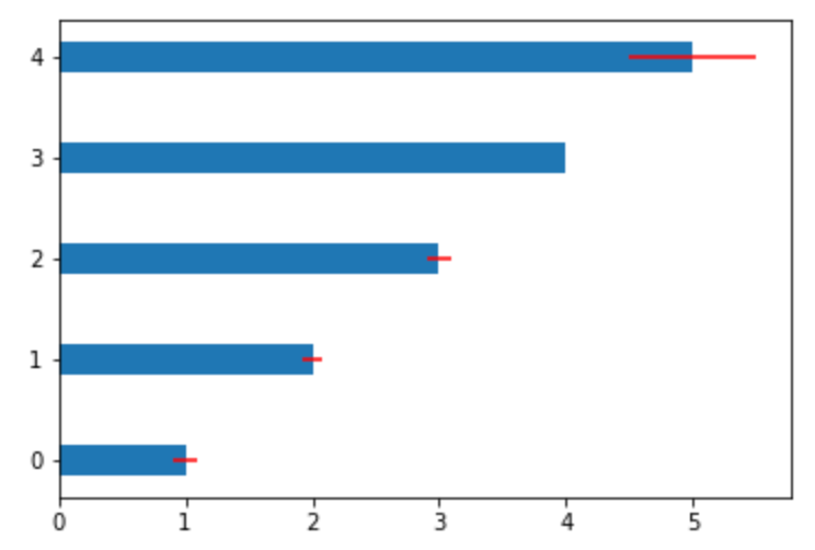
broken_barh 関数では、 軸に足をつけない棒グラフ を描画することができます。
実際には指定領域を矩形描画することになります。
1import numpy as np
2from matplotlib import pyplot as plt
3
4x =  [(1.5, 0.5)]
5y = (.5, 2.0)
6
7plt.broken_barh(x, y)
8plt.xlim(0)
9plt.ylim(0)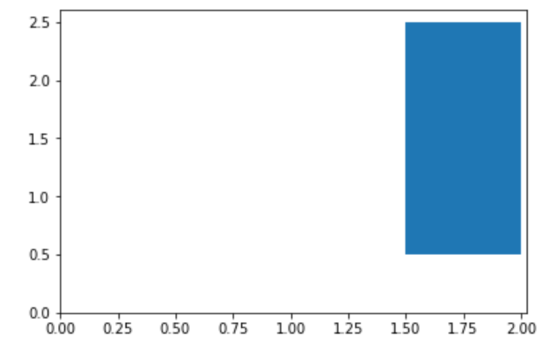
ヒストグラム:hist/hist2d
ヒストグラム を表示します。
1import numpy as np
2import matplotlib.pyplot as plt
3
4np.random.seed(0)
5
6mu, sigma = 100, 15
7x = mu + sigma * np.random.randn(100)
8
9plt.hist(x, 50, density=True, alpha=0.75)
2次元のヒストグラム を描画するには、 hist2d 関数を使用します。
1import numpy as np
2import matplotlib.pyplot as plt
3
4np.random.seed(0)
5
6x = np.random.randn(100000)
7y = np.random.randn(100000) + 5
8
9plt.hist2d(x, y, bins=40)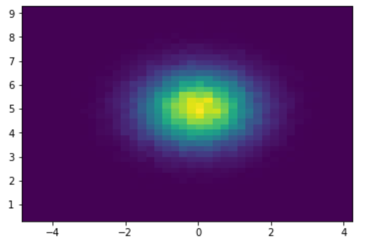
円グラフ:pie
円グラフ を描画します。 autopct (円グラフ上に値を表示する)オプションのように、グラフを修飾する多くのオプションが備わっています。
1from matplotlib import pyplot as plt
2from matplotlib.gridspec import GridSpec
3
4labels = 'A', 'B', 'C', 'D'
5fracs = [15, 30, 45, 10]
6
7plt.pie(fracs, labels=labels, autopct='%1.1f%%')
8plt.show()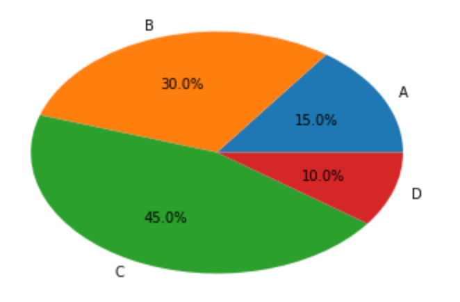
散布図:scatter
散布図 を描画します。 マーカーの大きさはオプション指定で変更しています。
 1from matplotlib import pyplot as plt
 2import numpy as np
 3
 4N = 50
 5x = np.random.rand(N)
 6y = np.random.rand(N)
 7
 8colors = np.random.rand(N)
 9area = np.pi * (15 * np.random.rand(N))**2
10
11plt.scatter(x, y, s=area, c=colors, alpha=0.5)
12plt.show()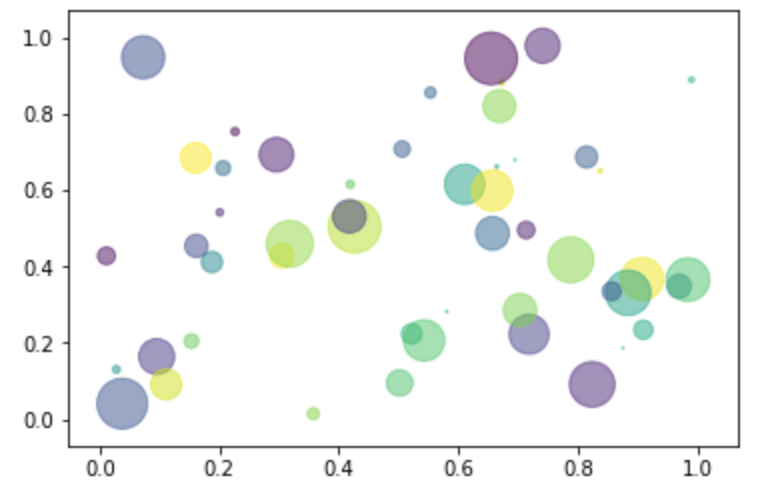
折れ線グラフ(積み上げ折れ線グラフ):plot/stackplot/plot_date
折り線グラフ は plot で描画できます。
1from matplotlib import pyplot as plt
2import numpy as np
3
4np.random.seed(0)
5
6x = np.random.rand(100)
7
8plt.plot(x)
9plt.show()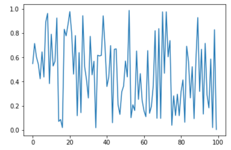
積み上げの折れ線グラフ を描画するには stackplot 関数を使います。
 1import numpy as np
 2from matplotlib import pyplot as plt
 3
 4x = [1, 2, 3, 4, 5]
 5y1 = [1, 1, 2, 3, 5]
 6y2 = [0, 4, 2, 6, 8]
 7y3 = [1, 3, 5, 7, 9]
 8
 9plt.stackplot(x, y1, y2, y3, labels=labels)
10plt.show()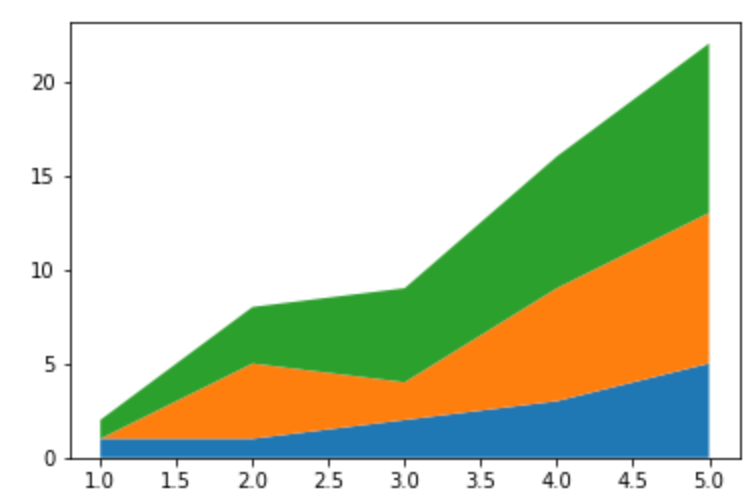
また、 x軸が日付データの場合の折れ線グラフ には plot_date 関数を用いることが可能です。
 1import matplotlib.pyplot as plt
 2from matplotlib.dates import (DateFormatter, drange)
 3import numpy as np
 4import datetime
 5
 6np.random.seed(0)
 7
 8formatter = DateFormatter('%Y/%m/%d/')
 9date1 = datetime.date(1970, 1, 1)
10date2 = datetime.date(2018, 4, 12)
11delta = datetime.timedelta(days=100)
12
13dates = drange(date1, date2, delta)
14s = np.random.rand(len(dates))
15
16plt.plot_date(dates, s)
17plt.show()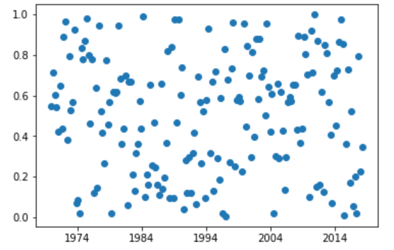
箱ひげ図:boxplot
箱ひげ図 (最小値、第1四分位点、中央値、第3四分位点、最大値)を描画します。
1import numpy as np
2from matplotlib import pyplot as plt
3import random
4
5a = np.array([1, 3, 0.25, 0.44, 5.88])
6plt.boxplot(a)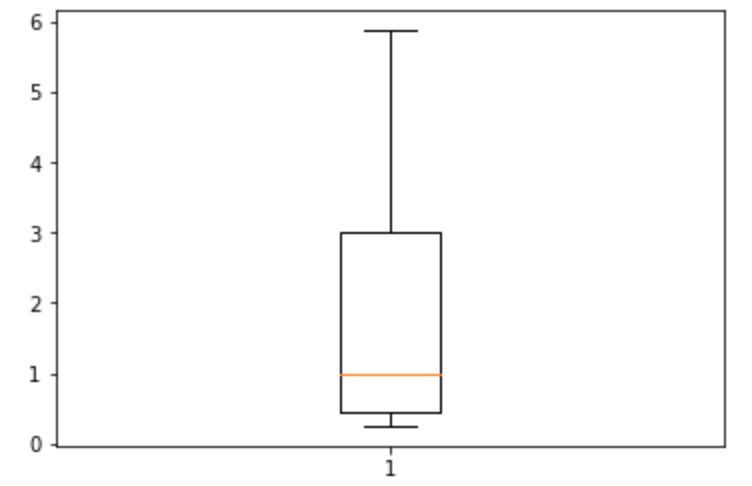
バイオリン図:violinplot
バイオリン図 (箱ひげ図に確率密度表示を加えたもの)を描画します。
 1import pandas as pd
 2import numpy as  np
 3from matplotlib import pyplot as plt
 4
 5fs = 10
 6pos = [1, 2, 4, 5, 7, 8]
 7data = [np.random.normal(0, std, size=100) for std in pos]
 8
 9plt.violinplot(data, pos, points=20, widths=0.3, showmeans=True, showextrema=True, showmedians=True)
10plt.show()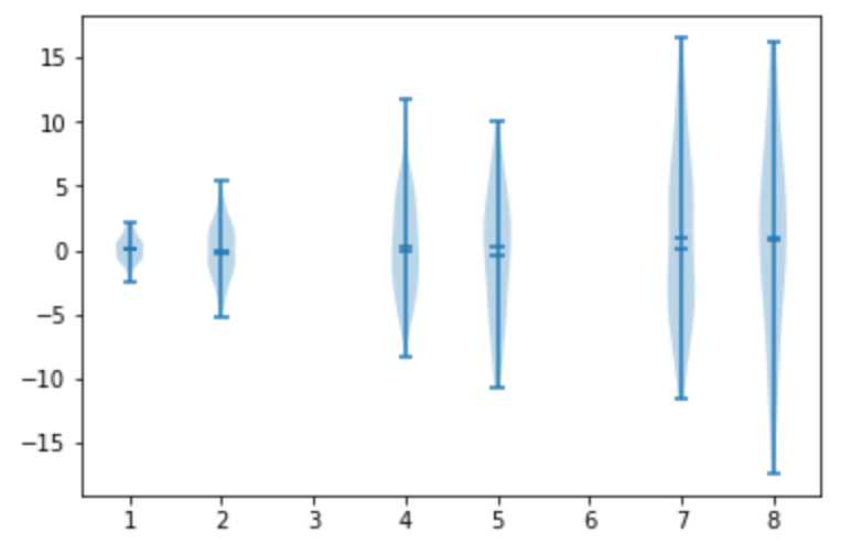
等高線・水平曲線:contour/contourf
等高線 (同じ高さの値の集まり)を描画します。
contour 単体だと値がわかりにくいので、 clabel や colorbar などで情報を付与すると良いです。
 1import numpy as np
 2import matplotlib.pyplot as plt
 3
 4delta = 0.025
 5x = np.arange(-4.0, 3.0, delta)
 6y = np.arange(-2.0, 2.0, delta)
 7X, Y = np.meshgrid(x, y)
 8Z1 = np.exp(-X**2 - Y**2)
 9Z2 = np.exp(-(X - 1)**2 - (Y - 1)**2)
10Z = (Z1 - Z2) * 2
11
12plt.figure()
13plt.contour(X, Y, Z)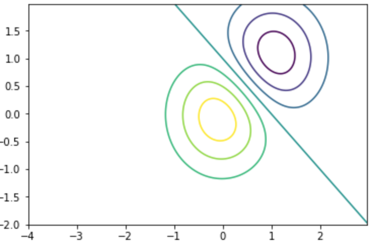
等高線の塗りつぶし には contourf を使います。
 1import numpy as np
 2import matplotlib.pyplot as plt
 3
 4delta = 0.025
 5x = np.arange(-4.0, 3.0, delta)
 6y = np.arange(-2.0, 2.0, delta)
 7X, Y = np.meshgrid(x, y)
 8Z1 = np.exp(-X**2 - Y**2)
 9Z2 = np.exp(-(X - 1)**2 - (Y - 1)**2)
10Z = (Z1 - Z2) * 2
11
12plt.figure()
13plt.contourf(X, Y, Z)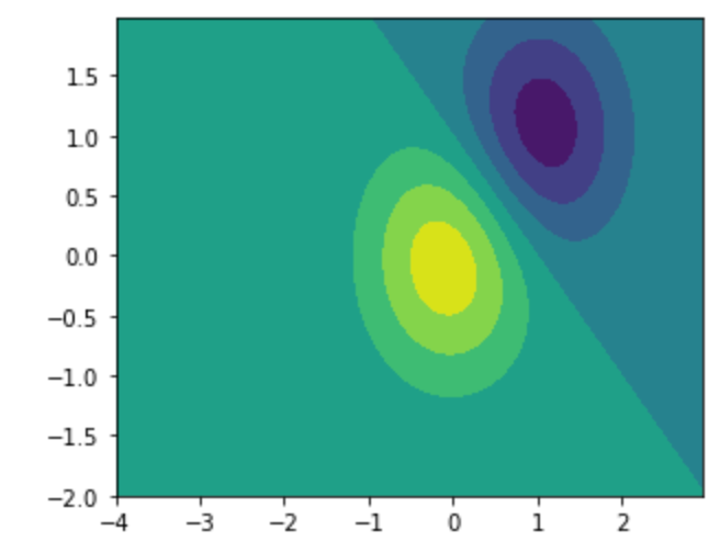
非構造三次元データ:tricontour/tricontourf
非構造三次元データ を扱う場合には tricontour 、 tricontourf を使います。
 1import matplotlib.pyplot as plt
 2import matplotlib.tri as tri
 3import numpy as np
 4
 5n_angles = 48
 6n_radii = 8
 7min_radius = 0.25
 8radii = np.linspace(min_radius, 0.95, n_radii)
 9
10angles = np.linspace(0, 2 * np.pi, n_angles, endpoint=False)
11angles = np.repeat(angles[..., np.newaxis], n_radii, axis=1)
12angles[:, 1::2] += np.pi / n_angles
13
14x = (radii * np.cos(angles)).flatten()
15y = (radii * np.sin(angles)).flatten()
16z = (np.cos(radii) * np.cos(3 * angles)).flatten()
17
18triang = tri.Triangulation(x, y)
19
20plt.gca().set_aspect('equal')
21plt.tricontourf(triang, z)
22plt.colorbar()
23plt.tricontour(triang, z, colors='k')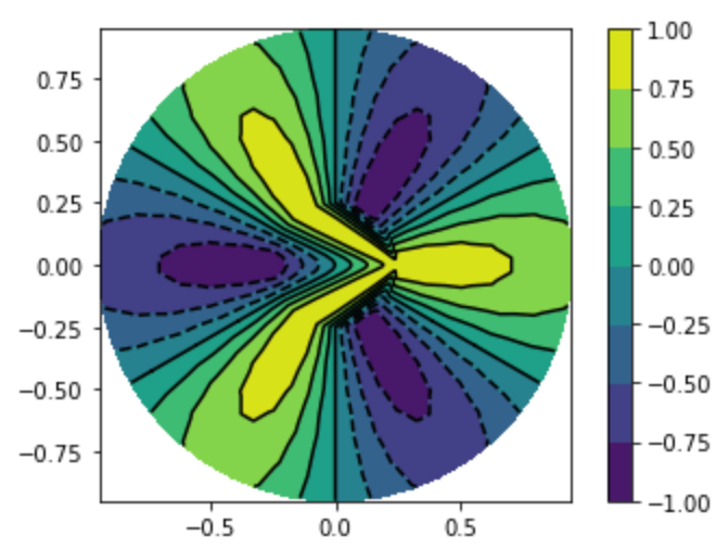
極座標:polar
極座標 の円状グラフを描画します。
1from matplotlib import pyplot as plt
2import numpy as np
3
4r = np.arange(0, 2, 0.01)
5theta = 2 * np.pi * r
6
7plt.polar(theta, r)
8plt.show()
対数:loglog/semilogx/semilogy
対数を描画します。 両対数 の場合には loglog 関数を使います。
1from matplotlib import pyplot as plt
2import numpy as np
3
4t = np.arange(0.01, 20.0, 0.01)
5plt.loglog(t, 20 * np.exp( -t / 10.0), basex=2)
6plt.grid(True)
7plt.title('loglog base 2 on x')
8plt.show()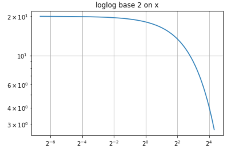
x軸を10を底とする対数スケールでの片対数 を描画する場合には semilogx を使用します。
1import numpy as np
2import matplotlib.pyplot as plt
3
4t = np.arange(0.01, 20.0, 0.01)
5
6plt.semilogx(t, np.sin(2*np.pi*t))
7plt.grid(True)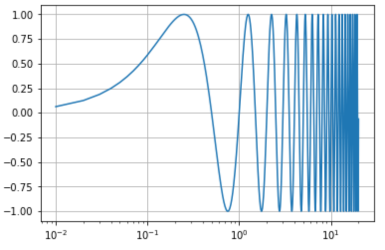
y軸を10を底とする対数スケールでの片対数 を描画する場合には semilogy を使用します。
1import numpy as np
2import matplotlib.pyplot as plt
3
4t = np.arange(0.01, 20.0, 0.01)
5
6plt.semilogy(t, np.exp(-t/5.0))
7plt.grid(True)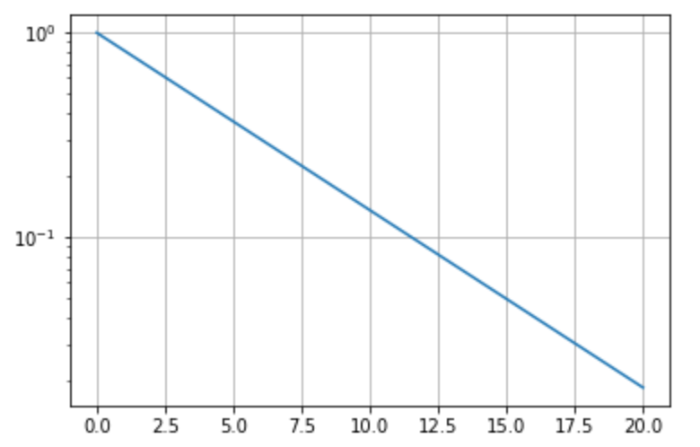
行列:matshow
行列データ を描画します。
1from matplotlib import pyplot as plt
2import numpy as np
3
4np.random.seed(0)
5
6mat = np.random.rand(10,10)
7plt.matshow(mat)
8
9plt.show()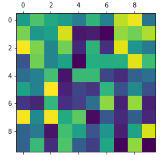
スパース行列:spy
スパース行列(疎行列) を描画します。
1from matplotlib import pyplot as plt
2import numpy as np
3
4x = np.random.randn(20, 20)
5x[5] = 0.
6x[:, 12] = 0.
7
8plt.spy(x, markersize=3)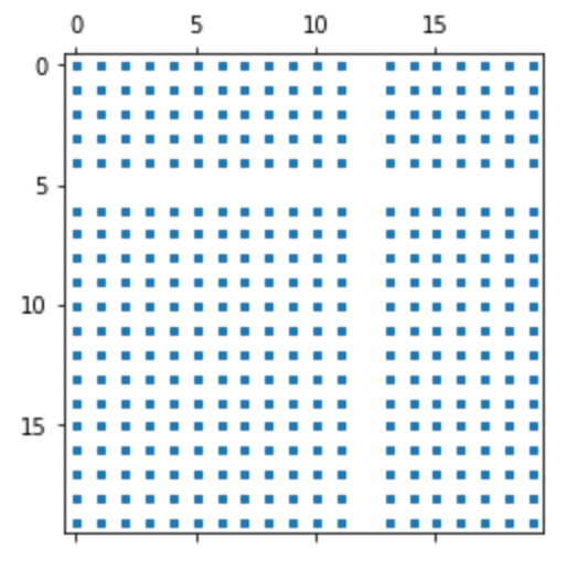
コヒーレンス:cohere
コヒーレンス(波の可干渉性) を描画することができます。
1import numpy as np
2import matplotlib.pyplot as plt
3
4n = 1024
5x = np.random.randn(n)
6y = np.random.randn(n)
7
8plt.cohere(x, y, NFFT=128)
9plt.figure()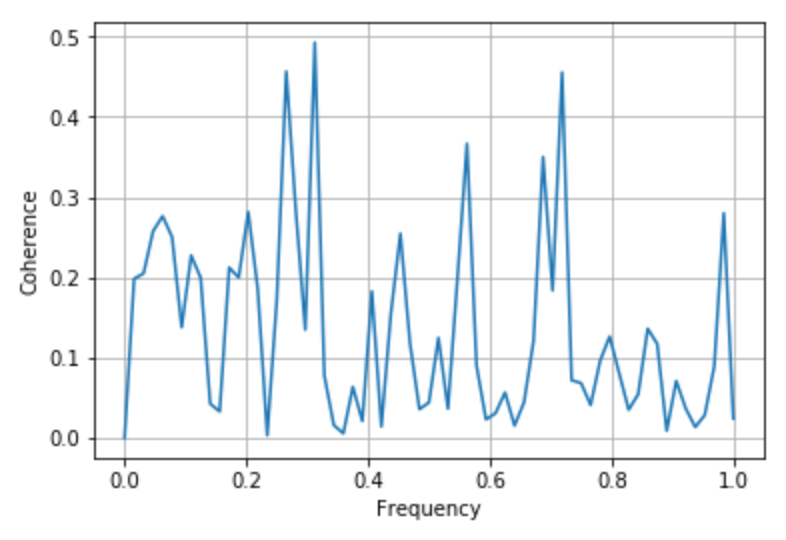
離散データ:stem
x軸から伸びるシーケンスとしてyの値 を描画したい場合に使います。
1from matplotlib import pyplot as plt
2import numpy as np
3
4x = np.linspace(0.1, 2 * np.pi, 10)
5plt.stem(x, np.cos(x), '-.')
6
7plt.show()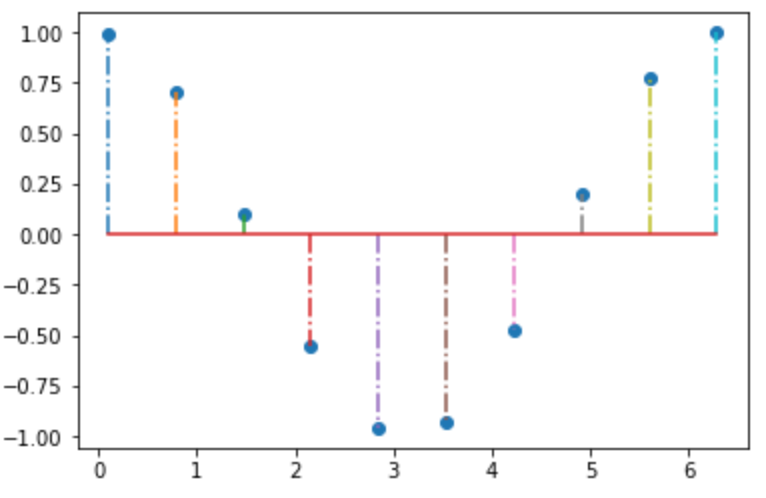
ステップ応答:step
ステップ応答 を描画します。コンピュータ信号のような離散値とかを扱うときに使います。
 1import numpy as np
 2from numpy import ma
 3import matplotlib.pyplot as plt
 4
 5x = np.arange(1, 7, 0.4)
 6y = np.sin(x).copy() + 2.5
 7
 8plt.step(x, y)
 9plt.scatter(x, y) #データを表す座標が見やすいようにしています
10plt.show()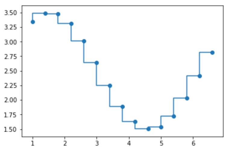
自己相関・相互相関:acorr/xcorr
acorr 関数で 自己相関 を描画することができます。
1import numpy as np
2from matplotlib import pyplot as plt
3
4x = np.random.normal(0, 10, 50)
5plt.acorr(x)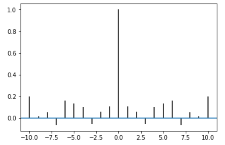
また、相互相関 を描画は xcorr になります。
1import matplotlib.pyplot as plt
2import numpy as np
3
4np.random.seed(0)
5
6x, y = np.random.randn(2, 100)
7plt.xcorr(x, y, usevlines=True, maxlags=50, normed=True, lw=2)
8
9plt.show()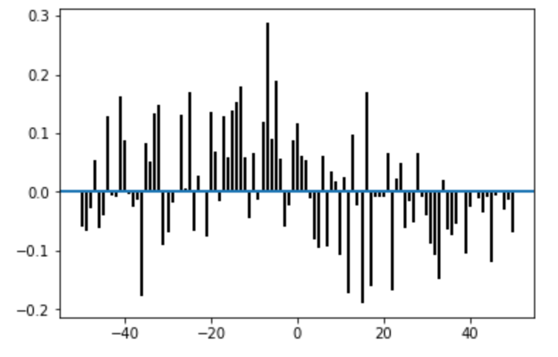
複数イベントデータ:eventplot
複数のイベントデータ を並行して描画する。公式から引用すると、以下のようなユースケースがあるらしいです。
This type of plot is commonly used in neuroscience for representing neural events, where it is usually called a spike raster, dot raster, or raster plot.
 1import numpy as np
 2from matplotlib import pyplot as plt
 3
 4np.random.seed(1)
 5
 6data = np.random.random([6, 50])
 7lineoffsets = np.array([-15, -3, 1, 1.5, 6, 10])
 8linelengths = [10, 2, 1, 1, 3, 1.5]
 9
10plt.figure()
11plt.eventplot(data, lineoffsets=lineoffsets,
12              linelengths=linelengths)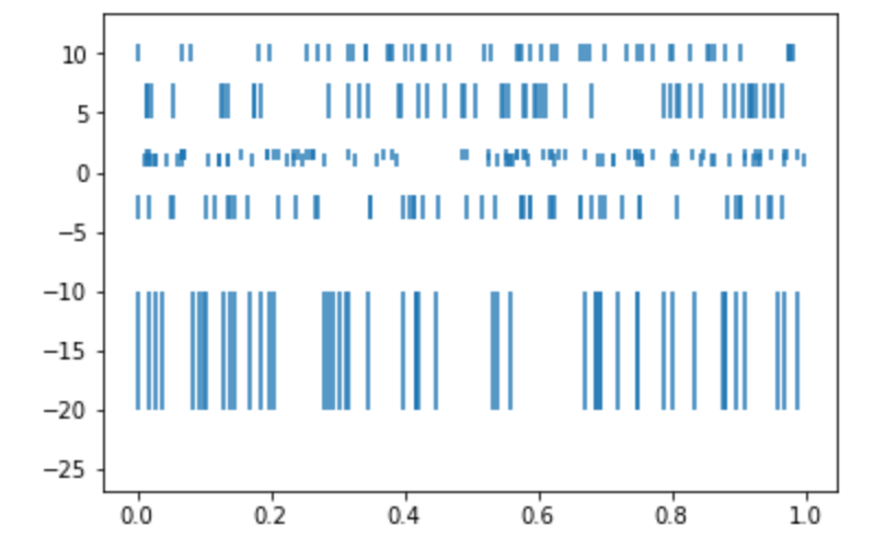
六角形で描画:hexbin
hex でデータを描画します。
1import numpy as np
2import matplotlib.pyplot as plt
3
4x = np.arange(1, 10, 1)
5y = np.arange(1, 10, 1)
6
7plt.hexbin(x, y, gridsize=10)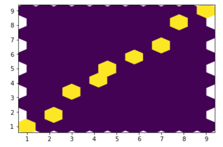
疑似カラー描画:pcolor/pcolormesh/tripcolor
2次元配列のデータを 擬似カラー で描画します。
 1import matplotlib.pyplot as plt
 2import numpy as np
 3
 4dx, dy = 0.15, 0.05
 5
 6y, x = np.mgrid[slice(-3, 3 + dy, dy),
 7                slice(-3, 3 + dx, dx)]
 8z = (1 - x / 2. + x ** 5 + y ** 3) * np.exp(-x ** 2 - y ** 2)
 9z = z[:-1, :-1]
10z_min, z_max = -np.abs(z).max(), np.abs(z).max()
11
12plt.pcolor(x, y, z, cmap='RdBu', vmin=z_min, vmax=z_max)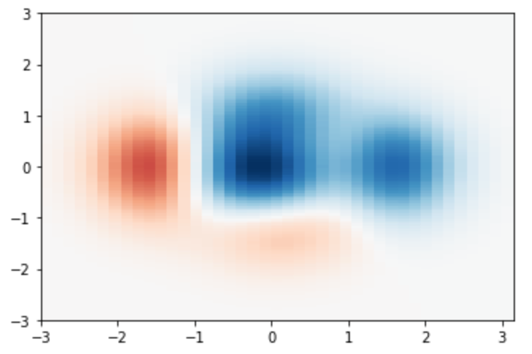
メッシュデータを高速に描画したい 場合には pcolormesh 関数を使うと良いそうです。
 1import matplotlib.pyplot as plt
 2import numpy as np
 3
 4dx, dy = 0.15, 0.05
 5
 6y, x = np.mgrid[slice(-3, 3 + dy, dy),
 7                slice(-3, 3 + dx, dx)]
 8z = (1 - x / 2. + x ** 5 + y ** 3) * np.exp(-x ** 2 - y ** 2)
 9z = z[:-1, :-1]
10z_min, z_max = -np.abs(z).max(), np.abs(z).max()
11
12plt.pcolormesh(x, y, z, cmap='RdBu', vmin=z_min, vmax=z_max)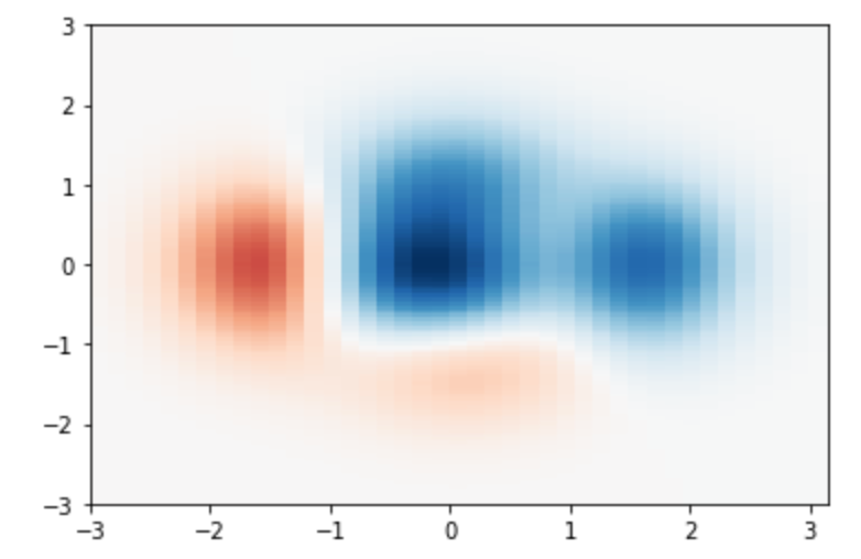
tricontour に対する疑似カラー描画 には tripcolor 関数を使います。
 1import matplotlib.pyplot as plt
 2import matplotlib.tri as tri
 3import numpy as np
 4
 5n_angles = 48
 6n_radii = 8
 7min_radius = 0.25
 8radii = np.linspace(min_radius, 0.95, n_radii)
 9
10angles = np.linspace(0, 2 * np.pi, n_angles, endpoint=False)
11angles = np.repeat(angles[..., np.newaxis], n_radii, axis=1)
12angles[:, 1::2] += np.pi / n_angles
13
14x = (radii * np.cos(angles)).flatten()
15y = (radii * np.sin(angles)).flatten()
16z = (np.cos(radii) * np.cos(3 * angles)).flatten()
17
18triang = tri.Triangulation(x, y)
19
20plt.gca().set_aspect('equal')
21plt.tricontourf(triang, z)
22plt.colorbar()
23plt.tripcolor(triang, z, shading='flat')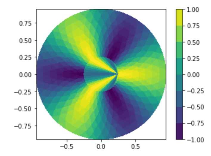
スペクトラム:magnitude_spectrum/phase_spectrum/angle_spectrum/specgram
信号の強さを表す 振幅スペクトラム は magnitude_spectrum で描画します。
 1from matplotlib import pyplot as plt
 2import numpy as np
 3
 4np.random.seed(0)
 5
 6dt = 0.01
 7Fs = 1/dt
 8t = np.arange(0, 10, dt)
 9nse = np.random.randn(len(t))
10r = np.exp(-t/0.05)
11cnse = np.convolve(nse, r)*dt
12cnse = cnse[:len(t)]
13
14s = 0.1*np.sin(2*np.pi*t) + cnse
15
16plt.magnitude_spectrum(s, Fs=Fs)
17plt.show()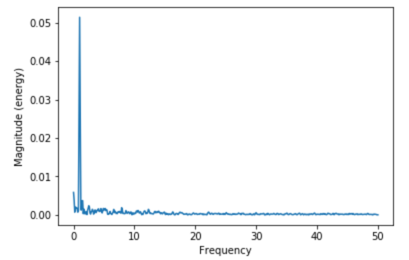
位相スペクトラム は phase_spectrum で描画します。
 1from matplotlib import pyplot as plt
 2import numpy as np
 3
 4np.random.seed(0)
 5
 6dt = 0.01
 7Fs = 1/dt
 8t = np.arange(0, 10, dt)
 9nse = np.random.randn(len(t))
10r = np.exp(-t/0.05)
11
12cnse = np.convolve(nse, r)*dt
13cnse = cnse[:len(t)]
14s = 0.1*np.sin(2*np.pi*t) + cnse
15
16plt.phase_spectrum(s, Fs=Fs)
17plt.show()
角度スペクトラム は angle_spectrum で描画します。
1import numpy as np
2from matplotlib import pyplot as plt
3
4x = np.random.normal(0, 10, 50)
5plt.angle_spectrum(x)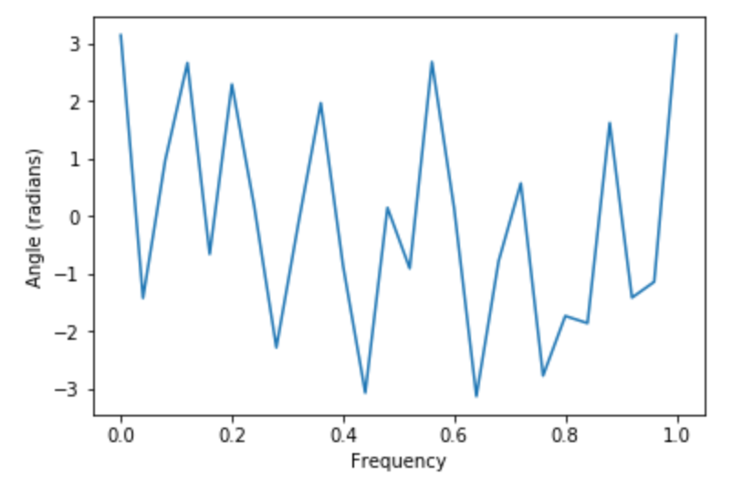
スペクトログラム は specgram になります。
 1import matplotlib.pyplot as plt
 2import numpy as np
 3
 4np.random.seed(0)
 5
 6dt = 0.0005
 7t = np.arange(0.0, 20.0, dt)
 8s1 = np.sin(2 * np.pi * 100 * t)
 9s2 = 2 * np.sin(2 * np.pi * 400 * t)
10
11mask = np.where(np.logical_and(t > 10, t < 12), 1.0, 0.0)
12s2 = s2 * mask
13
14nse = 0.01 * np.random.random(size=len(t))
15
16x = s1 + s2 + nse
17NFFT = 1024
18Fs = int(1.0 / dt)
19
20plt.specgram(x, NFFT=NFFT, Fs=Fs, noverlap=900)
21plt.show()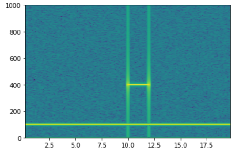
スペクトル密度:psd/csd
パワースペクトル密度 は psd で描画します。
 1from matplotlib import pyplot as plt
 2import numpy as np
 3from matplotlib import mlab as mlab
 4
 5np.random.seed(0)
 6
 7dt = 0.01
 8t = np.arange(0, 10, dt)
 9nse = np.random.randn(len(t))
10r = np.exp(-t / 0.05)
11
12cnse = np.convolve(nse, r) * dt
13cnse = cnse[:len(t)]
14s = 0.1 * np.sin(2 * np.pi * t) + cnse
15
16plt.psd(s, 512, 1 / dt)
17plt.show()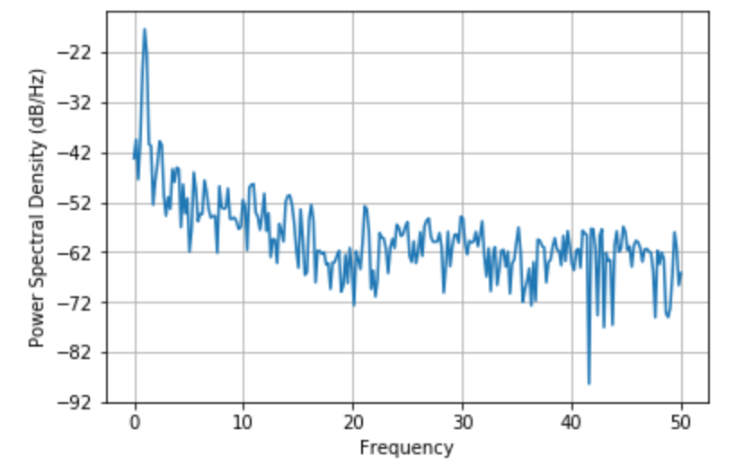
クロススペクトル密度 は csd で描画します。
 1from scipy import signal
 2from matplotlib import pyplot as plt
 3
 4fs = 10e3
 5N = 1e5
 6amp = 20
 7freq = 1234.0
 8noise_power = 0.001 * fs / 2
 9time = np.arange(N) / fs
10b, a = signal.butter(2, 0.25, 'low')
11x = np.random.normal(scale=np.sqrt(noise_power), size=time.shape)
12y = signal.lfilter(b, a, x)
13x += amp*np.sin(2*np.pi*freq*time)
14y += np.random.normal(scale=0.1*np.sqrt(noise_power), size=time.shape)
15
16plt.figure()
17plt.csd(x, y)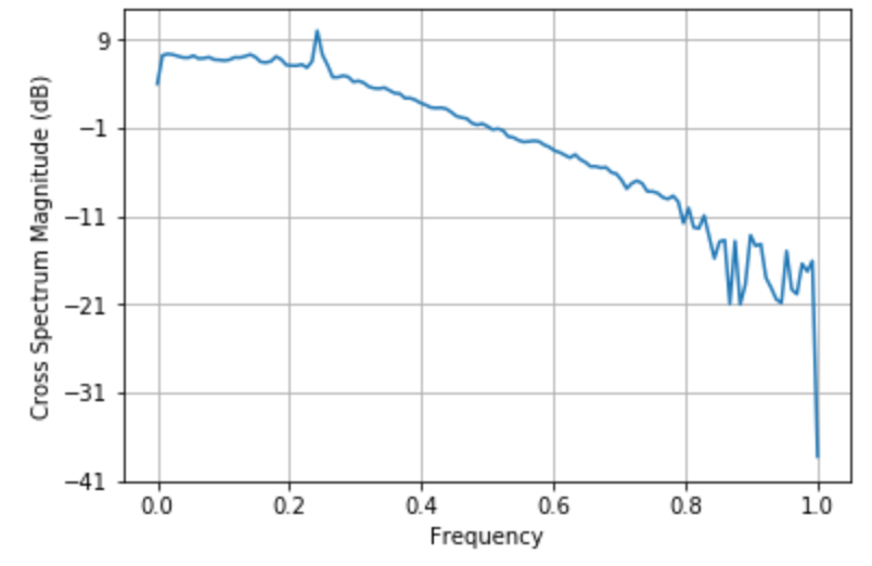
ベクトル:quiver/quiverkey
ベクトル を描画します。また、 quiverkey 関数を使うことで、ベクトルのキー も描画することができます。
 1from matplotlib import pyplot as plt
 2import numpy as np
 3
 4X, Y = np.meshgrid(np.arange(0, 2 * np.pi, .2), np.arange(0, 2 * np.pi, .2))
 5U = np.cos(X)
 6V = np.sin(Y)
 7
 8Q = plt.quiver(X, Y, U, V, units='width')
 9plt.quiverkey(Q, 0.5, 0.9, 2, r'$2 \frac{m}{s}$', labelpos='E', coordinates='figure')
10plt.show()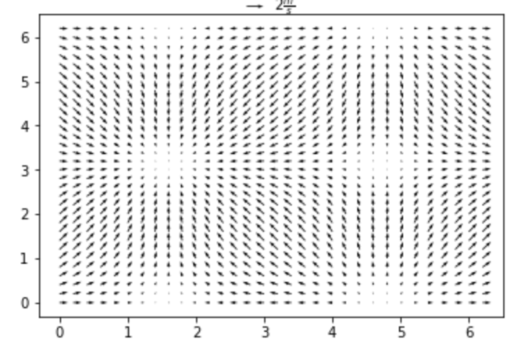
流線グラフ:streamplot
流線 を描画します。
1import numpy as np
2import matplotlib.pyplot as plt
3
4Y, X = np.mgrid[-3:3:100j, -3:3:100j]
5U = -1 - X**2 + Y
6V = 1 + X - Y**2
7speed = np.sqrt(U*U + V*V)
8
9plt.streamplot(X, Y, U, V, color=U, linewidth=2, cmap=plt.cm.autumn)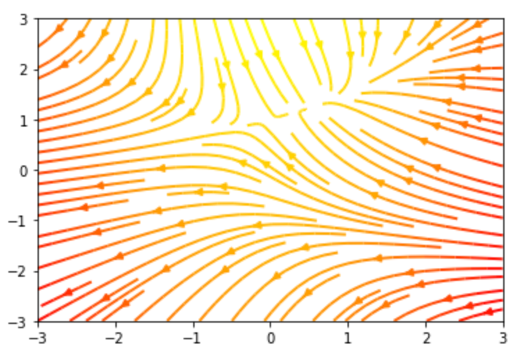
グラフに付加情報を加える
グラフに付加情報を加えることで、プロットされたデータの理解を補助することができます。 以下ではグラフに付加情報を加える関数を調べてみました。
グラフのタイトル:title/suptitle
グラフに タイトルをつける には title 関数を使います。
複数グラフにタイトルをつける には suptitle 関数を使います。
 1from matplotlib import pyplot as plt
 2import numpy as np
 3
 4def f(t):
 5    return np.cos(2*np.pi*t)
 6
 7t1 = np.arange(0.0, 5.0, 0.1)
 8t2 = np.arange(0.0, 2.0, 0.01)
 9
10plt.subplot(121)
11plt.plot(t1, f(t1), '-')
12plt.title('subplot 1')
13plt.suptitle('Suptitle', fontsize=16)
14
15
16plt.subplot(122)
17plt.plot(t2, np.cos(2*np.pi*t2), '--')
18plt.title('subplot 2')
19
20plt.show()
凡例の追加:legend/colorbar
グラフデータの凡例 を追加します。
1from matplotlib import pyplot as plt
2import numpy as np
3
4x_data = (1, 2, 3)
5y_data = (.5, 1.5 , .8)
6
7plt.bar(x_data, y_data)
8plt.legend(['dataA'])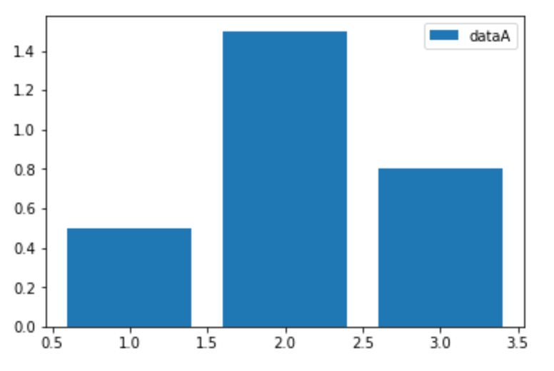
等高線(contour)に対する、 色が表す値の凡例 は colorbar 関数で表示します。
 1import numpy as np
 2import matplotlib.pyplot as plt
 3
 4delta = 0.025
 5x = np.arange(-4.0, 3.0, delta)
 6y = np.arange(-2.0, 2.0, delta)
 7X, Y = np.meshgrid(x, y)
 8Z1 = np.exp(-X**2 - Y**2)
 9Z2 = np.exp(-(X - 1)**2 - (Y - 1)**2)
10Z = (Z1 - Z2) * 2
11
12plt.figure()
13plt.contourf(X, Y, Z)
14plt.colorbar()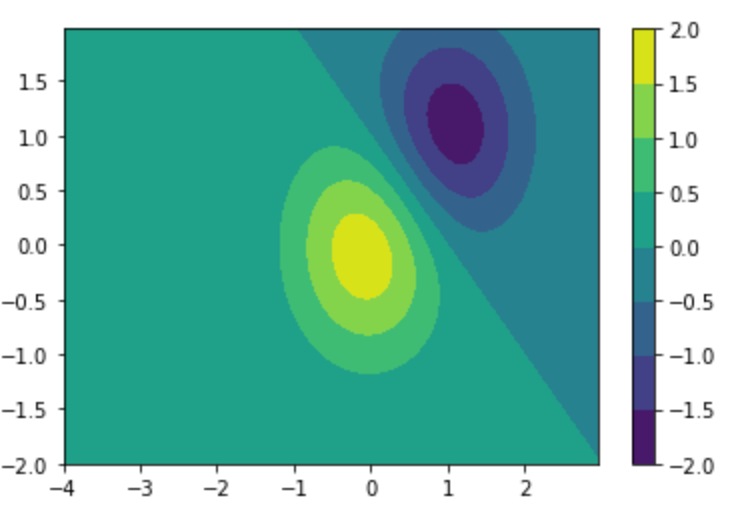
ラベルの表示:xlabel/ylabel/clabel
グラフの軸に ラベル を表示します。
 1from matplotlib import pyplot as plt
 2import numpy as np
 3import matplotlib
 4
 5np.random.seed(0)
 6
 7x = np.arange(0.0, 50.0, 2.0)
 8y = x ** 1.3 + np.random.rand(*x.shape) * 30.0
 9s = np.random.rand(*x.shape) * 800 + 500
10
11plt.scatter(x, y, s, c="g", alpha=0.5, label="Luck")
12plt.xlabel("Label X")
13plt.ylabel("Label Y")
14plt.show()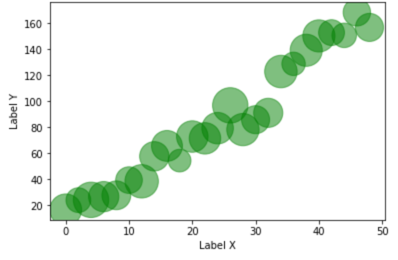
等高線(contour)に対しては clabel 関数で 色が表す値のラベル を表示します。
 1import numpy as np
 2import matplotlib.pyplot as plt
 3
 4delta = 0.025
 5x = np.arange(-4.0, 3.0, delta)
 6y = np.arange(-2.0, 2.0, delta)
 7X, Y = np.meshgrid(x, y)
 8Z1 = np.exp(-X**2 - Y**2)
 9Z2 = np.exp(-(X - 1)**2 - (Y - 1)**2)
10Z = (Z1 - Z2) * 2
11
12plt.figure()
13CS = plt.contour(X, Y, Z)
14plt.clabel(CS, inline=1, fontsize=10)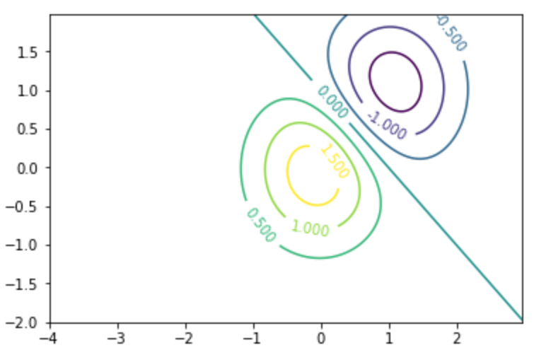
軸の描画範囲を制限:xlim/ylim
デフォルトだとデータの範囲に合わせてx軸/y軸の範囲が決まりますが、 軸の値の範囲 を変更できます。
 1import numpy as np
 2from matplotlib import pyplot as plt
 3
 4x = np.linspace(-np.pi, np.pi, 100)
 5
 6plt.xlim(-2, 2)
 7plt.ylim(-0.75, 0.75)
 8
 9plt.plot(x, np.sin(x),label="y = sinx")
10plt.show()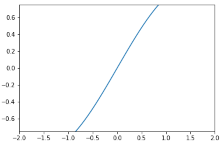
軸のスケールの変更:xscale/yscale
軸のスケール を変更します。linear log logit symlog を指定でき、対数をとった描画等ができます。
1import numpy as np
2from matplotlib import pyplot as plt
3
4x = np.linspace(-np.pi, np.pi, 100)
5
6plt.xscale('symlog')
7
8plt.plot(x, np.sin(x))
9plt.show()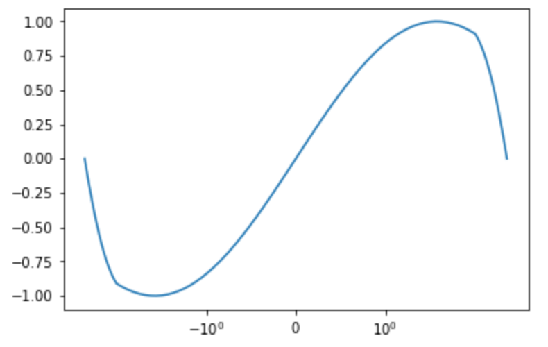
1import numpy as np
2from matplotlib import pyplot as plt
3
4x = np.linspace(-np.pi, np.pi, 100)
5
6plt.yscale('log')
7
8plt.plot(x, np.sin(x))
9plt.show()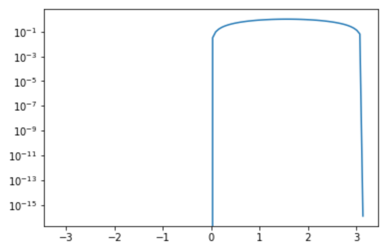
目盛りの変更:xticks/yticks
目盛り をカスタマイズするには xticks yticks 関数を使います。
1from matplotlib import pyplot as plt
2import numpy as np
3
4x = np.arange(4)
5y = [10, 20, 30, 40]
6
7plt.bar(x, y)
8plt.xticks(x, ('A', 'B', 'C', 'D'))
9plt.show()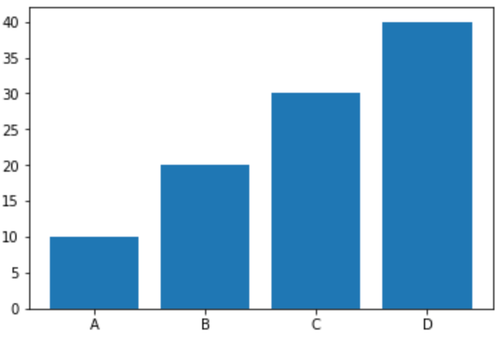
1from matplotlib import pyplot as plt
2import numpy as np
3
4x = np.arange(4)
5y = [10, 20, 30, 40]
6
7plt.bar(x, y)
8plt.yticks(y, ('10', '20', '30', '40'))
9plt.show()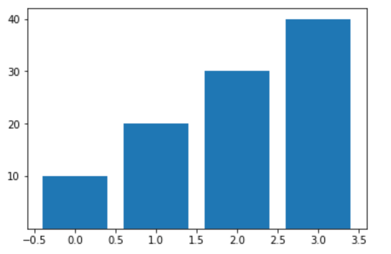
表(テーブル)の表示:table
描画データの 表(テーブル) を表示します。 パッと見た感じ、表単体で描画するのはできなそうでした。
 1import numpy as np
 2from matplotlib import pyplot as plt
 3
 4data = [[ 66386, 174296,  75131, 577908,  32015],
 5        [ 58230, 381139,  78045,  99308, 160454],
 6        [ 89135,  80552, 152558, 497981, 603535],
 7        [ 78415,  81858, 150656, 193263,  69638],
 8        [139361, 331509, 343164, 781380,  52269]]
 9columns = ('Freeze', 'Wind', 'Flood', 'Quake', 'Hail')
10rows = ['%d year' % x for x in (100, 50, 20, 10, 5)]
11
12plt.table(cellText=data,
13                      rowLabels=rows,
14                      rowColours=colors,
15                      colLabels=columns,
16                      loc='bottom')
17
18plt.show()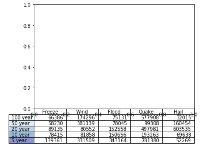
軸に対する描画データの追加:twinx/twiny
同一の軸に対して別のデータを描画します。
x軸はそのままに、別のyの値を描画する には twinx 関数を使います。
 1import numpy as np
 2from matplotlib import pyplot as plt
 3
 4fig, ax1 = plt.subplots()
 5t = np.arange(0.01, 10.0, 0.01)
 6s1 = np.exp(t)
 7ax1.plot(t, s1, 'b-')
 8ax1.set_xlabel('time (s)')
 9ax1.set_ylabel('exp', color='b')
10ax1.tick_params('y', colors='b')
11
12ax2 = ax1.twinx()
13s2 = np.sin(2 * np.pi * t)
14ax2.plot(t, s2, 'r.')
15ax2.set_ylabel('sin', color='r')
16ax2.tick_params('y', colors='r')
17
18plt.show()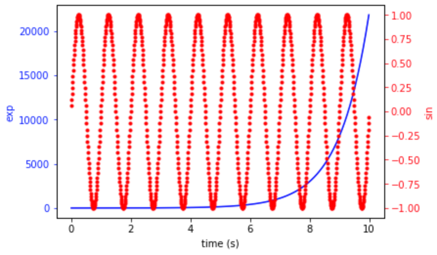
y軸はそのままに、別のxの値を描画する には twiny 関数を使います。
 1import numpy as np
 2from matplotlib import pyplot as plt
 3
 4fig, ax1 = plt.subplots()
 5t = np.arange(0.01, 10.0, 0.01)
 6s1 = np.exp(t)
 7ax1.plot(t, s1, 'b-')
 8ax1.set_xlabel('time (s)')
 9ax1.set_ylabel('exp', color='b')
10ax1.tick_params('y', colors='b')
11
12ax2 = ax1.twiny()
13t2 = np.arange(10.01, 20.0, 0.01)
14s2 = np.exp(t2)
15ax2.plot(t2, s2, 'r.')
16ax2.set_xlabel('sin', color='r')
17ax2.tick_params('y', colors='r')
18
19plt.show()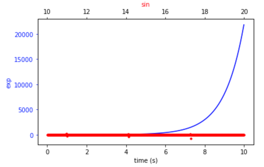
注釈の追加:annotate
注釈を追加 します。特定のデータポイントを指し示すときに使います。
xycoords オプションによって、xy や xytext の振る舞いが変わる点に注意が必要です。
 1import numpy as np
 2import matplotlib.pyplot as plt
 3
 4fig = plt.figure()
 5ax = fig.add_subplot(111)
 6
 7t = np.arange(0.0, 5.0, 0.01)
 8s = np.cos(2*np.pi*t)
 9line, = ax.plot(t, s, lw=2)
10
11# xycoordsがデフォルトの'data'なので、
12# 座標(4, 1)のデータに対して座標(3, 1.5)にテキストを表示して
13# 矢印で線を引っ張る
14ax.annotate('max', xy=(4, 1), xytext=(3, 1.5),
15            arrowprops=dict(facecolor='black', shrink=0.05),
16            )
17
18ax.set_ylim(-2,2)
19plt.show()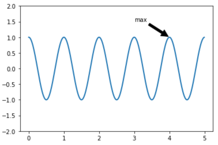
矢印(直線)の追加:arrow
矢印を描画 します。 head_width head_length オプションを記入しないとただの直線として描画されます。
 1import numpy as np
 2import matplotlib.pyplot as plt
 3
 4fig = plt.figure()
 5ax = fig.add_subplot(111)
 6
 7#head_widthとhead_lengthを入れないと矢印にならない
 8ax.arrow(x=0.5, y=0.5, dx=1.0, dy=1.0, ls='--', head_width=0.1, head_length=0.1)
 9
10ax.set_xlim(0.25, 1.75)
11ax.set_ylim(0.25, 1.75)
12plt.show()![]()
平行・垂直の線を引く:axhline/axvline/hlines/vlines
axhline 関数は x軸に対する平行線 を引きます。
また、 xmin xmax オプションで、直線を引く区間を指定できるのが便利です。
1import numpy as np
2import matplotlib.pyplot as plt
3
4fig = plt.figure()
5ax = fig.add_subplot(111)
6
7plt.axhline(y=.5, xmin=0.25, xmax=0.75)
8plt.show()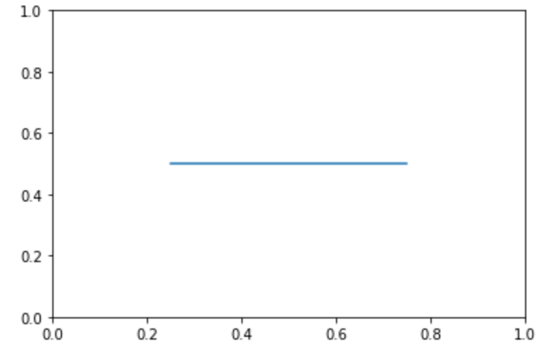
同様に x軸に対する平行線を複数引く には hlines 関数が便利です。
指定された xmin や xmax は複数の線全てに適用されます。
 1import numpy as np
 2import matplotlib.pyplot as plt
 3
 4np.random.seed(0)
 5
 6xmin = 1
 7xmax =  10
 8
 9plt.hlines([-1, 1], xmin, xmax)
10plt.show()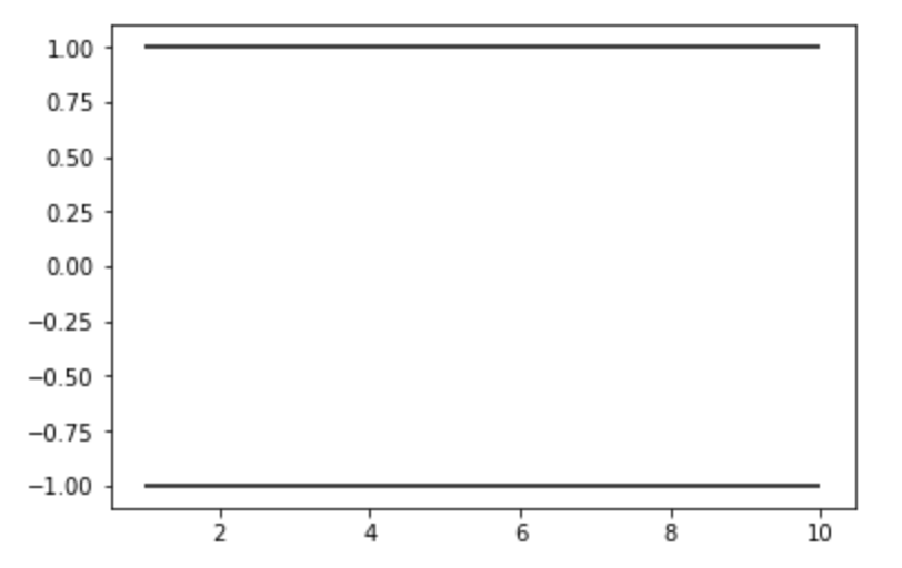
axvline関数は x軸に対する垂直の線 を引くことが出来ます。オプションの概念は axhline と同様です。
1import numpy as np
2import matplotlib.pyplot as plt
3
4fig = plt.figure()
5ax = fig.add_subplot(111)
6
7plt.axvline(x=.5, ymin=0.25, ymax=0.75, color='r', linewidth=4)
8plt.show()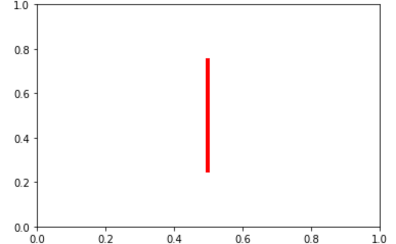
同様に x軸に対する垂直の線を複数引く には vlines 関数が便利です。
指定された ymin や xmax は複数の線全てに適用されます。
 1import numpy as np
 2import matplotlib.pyplot as plt
 3
 4np.random.seed(0)
 5
 6ymin = 1
 7ymax =  10
 8
 9plt.vlines([-1, 1], ymin, ymax)
10plt.show()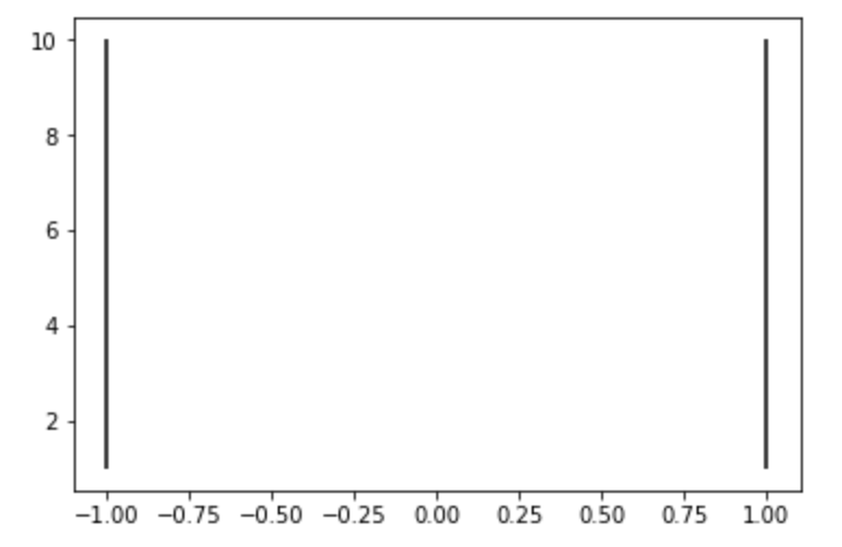
矩形の描画:axhspan/axvspan
axhspan 関数では x軸と平行の矩形(四角形) を描画することができます。
y軸の範囲を表現したいときに使います。
xmin xmax ymin ymax オプションを指定した場合は矩形を描画するという意味では axvspan と変わりません。
1import numpy as np
2import matplotlib.pyplot as plt
3
4fig = plt.figure()
5ax = fig.add_subplot(111)
6
7# yが1.25〜1.55までを一律で塗りつぶし
8plt.axhspan(1.25, 1.55, facecolor='g', alpha=0.5)
9plt.show()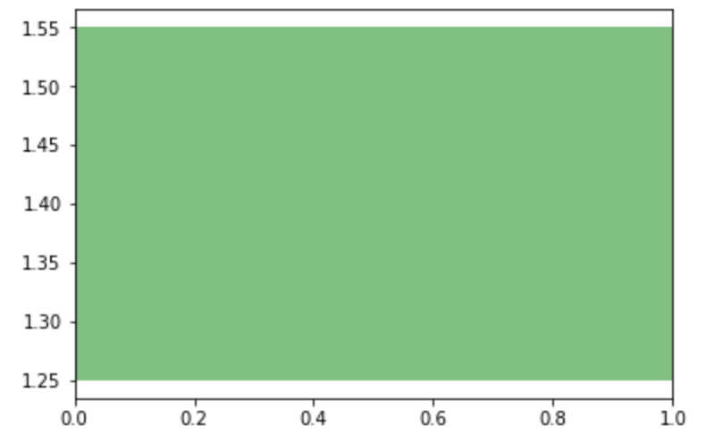
axvspan 関数では y軸と平行の矩形(四角形) を描画することができます。
x軸の範囲を表現したいときに使います。
xmin xmax ymin ymax オプションを指定した場合は矩形を描画するという意味では axhspan と変わりません。
1import numpy as np
2import matplotlib.pyplot as plt
3
4fig = plt.figure()
5ax = fig.add_subplot(111)
6
7plt.axvspan(1.25, 1.55, facecolor='g', alpha=0.5)
8plt.show()
誤差の表示:errorbar
データの誤差 を棒で表します。
uplims lolims オプションで、上下のどちらの誤差か指定することもできます。
 1import numpy as np
 2import matplotlib.pyplot as plt
 3
 4fig = plt.figure(0)
 5x = np.arange(10.0)
 6y = np.sin(np.arange(10.0) / 20.0)
 7
 8plt.errorbar(x, y, yerr=0.1)
 9
10y = np.sin(np.arange(10.0) / 20.0) + 1
11plt.errorbar(x, y, yerr=0.1, uplims=True)
12
13y = np.sin(np.arange(10.0) / 20.0) + 2
14plt.errorbar(x, y, yerr=0.1, lolims=True)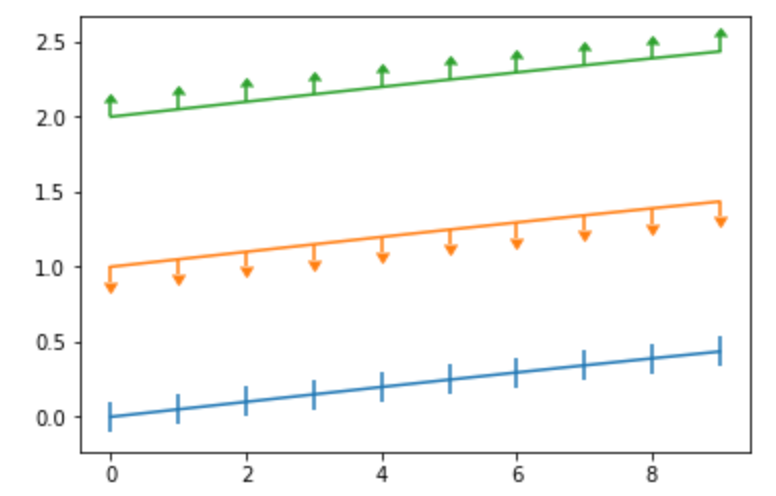
テキストの追加:text/figtext
text 関数はグラフ上に テキストを追加 します。 オプション指定で修飾することもできます。
描画位置の指定は座標系に対して行います。
 1from matplotlib import pyplot as plt
 2
 3plt.text(0.6, 0.5, "hogehoge", size=20, rotation=20.,
 4         ha="center", va="center",
 5         bbox=dict(boxstyle="square",
 6                   ec=(1., 0.5, 0.5),
 7                   fc=(1., 0.8, 0.8),
 8                   )
 9         )
10
11plt.text(0.2, 0.5, "fugafuga", size=20, rotation=20.,
12         ha="center", va="center"
13         )
14
15plt.show()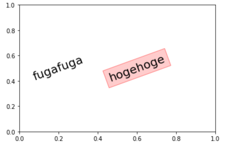
同様に テキストを追加する 関数で figtext が存在します。
描画位置の指定は図に対する相対位置であることに注意が必要です。(座標に依存しません)
 1import numpy as np
 2import matplotlib.pyplot as plt
 3
 4fig = plt.figure(0)
 5x = np.arange(10.0)
 6y = np.sin(np.arange(10.0) / 20.0)
 7
 8plt.errorbar(x, y)
 9# x軸方向の中央(0.5)
10# y軸方向の1/4(0.25)の場所に
11# 文字「x」を埋め込む
12plt.figtext(0.5, 0.25, '$x$')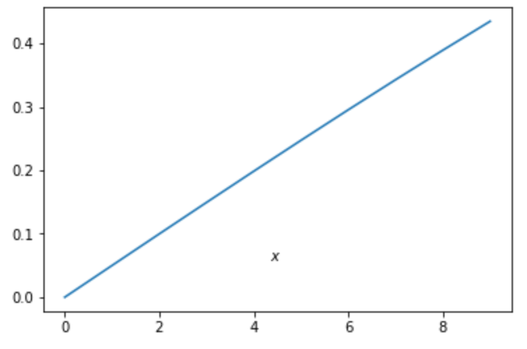
範囲の塗りつぶし:fill/fill_between/fill_betweenx
グラフ上の 範囲を色で塗りつぶして 描画します。
fill ではy=0との間の色が塗りつぶされます。
1import numpy as np
2import matplotlib.pyplot as plt
3
4x = np.arange(0.0, 2, 0.01)
5y = np.sin(2*np.pi*x)
6
7#0〜y or y〜0の間を塗りつぶす
8plt.fill(x, y)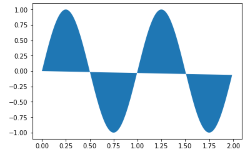
塗りつぶし範囲のyを指定する には fill_between 関数を使用します。
1import numpy as np
2import matplotlib.pyplot as plt
3
4x = np.arange(0.0, 2, 0.01)
5y1 = np.sin(2*np.pi*x)
6y2 = 0.5
7
8#y1〜y2の間を塗りつぶす
9plt.fill_between(x, y1, y2)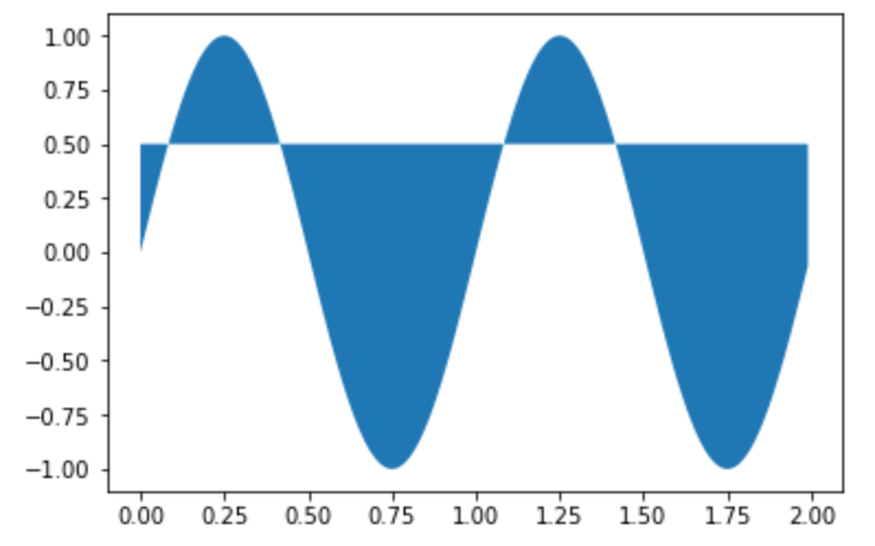
x軸に対して塗りつぶし範囲を指定する には fill_betweenx 関数を使います。
1import numpy as np
2import matplotlib.pyplot as plt
3
4y = np.arange(0.0, 2, 0.01)
5x1 = np.sin(2*np.pi*x)
6x2 = 0.5
7
8#x1〜x2の範囲を塗りつぶす
9plt.fill_betweenx(y, x1, x2)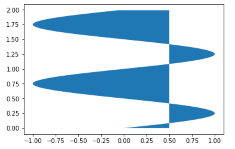
風向きの追加:barbs
天気図で使う風向きとその強さ を表す記号を描画します。
1import numpy as np
2import matplotlib.pyplot as plt
3
4x =  (1, 2, 3, 4, 5)
5y = (1, 2, 3, 4, 5)
6u = (10,20,-30,40,-50)
7v = (10,20,30,40,50)
8
9plt.barbs(x, y, u, v)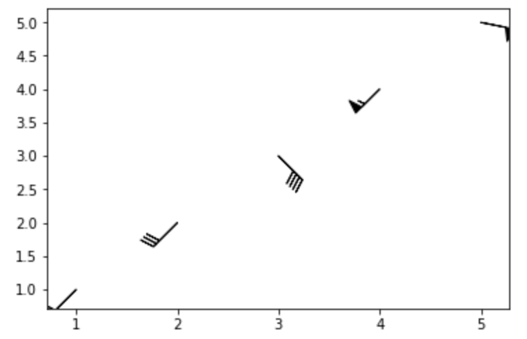
グラフのレイアウトを修正する
図を見やすくするために、グラフのレイアウトを微調整します。
グラフの位置変更:axes
グラフの位置を変更 します。 複数のグラフを重ね合わせる ときなどに使用します。
1import matplotlib.pyplot as plt
2import numpy as np
3
4x = np.random.normal(0, 10, 50)
5plt.acorr(x)
6
7# 引数は図を描画する位置の [left, bottom, width, height]を表す
8plt.axes([.65, .6, .2, .2], facecolor='k')
9plt.angle_spectrum(x)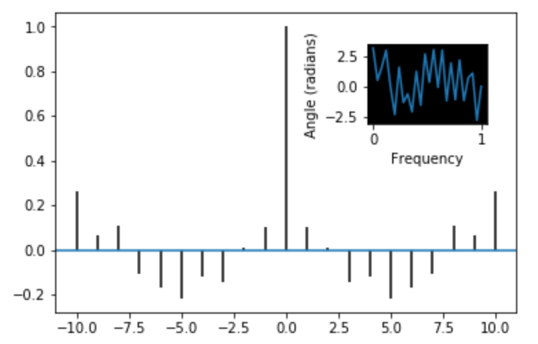
外枠の表示/非表示:box
グラフの 枠の表示/非表示 を設定します。デフォルトではTrue(表示する)です。
1import numpy as np
2from matplotlib import pyplot as plt
3
4x =  np.arange(5)
5y = (1, 2, 3, 4, 5)
6width = 0.3
7
8plt.barh(x, y, width, align='center')
9plt.box(False)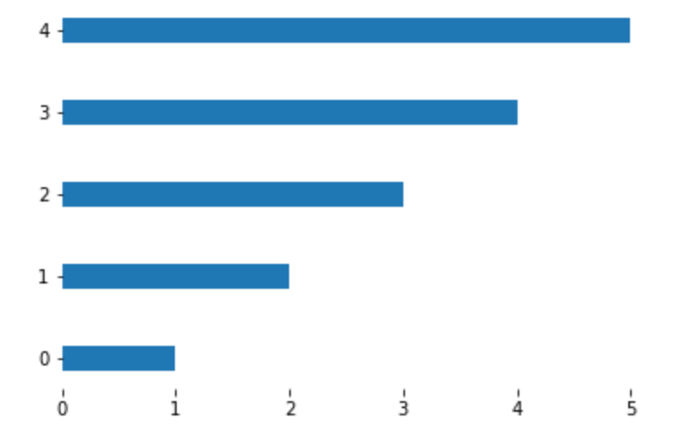
グリッド(格子)の表示:grid/rgrids/thetagrids/triplot
グラフ内に グリッドを表示 します。
 1import numpy as np
 2import matplotlib.pyplot as plt
 3
 4np.random.seed(0)
 5
 6mu, sigma = 100, 15
 7x = mu + sigma * np.random.randn(100)
 8
 9plt.hist(x, 50, density=True, alpha=0.75)
10plt.grid(linestyle='-', linewidth=1)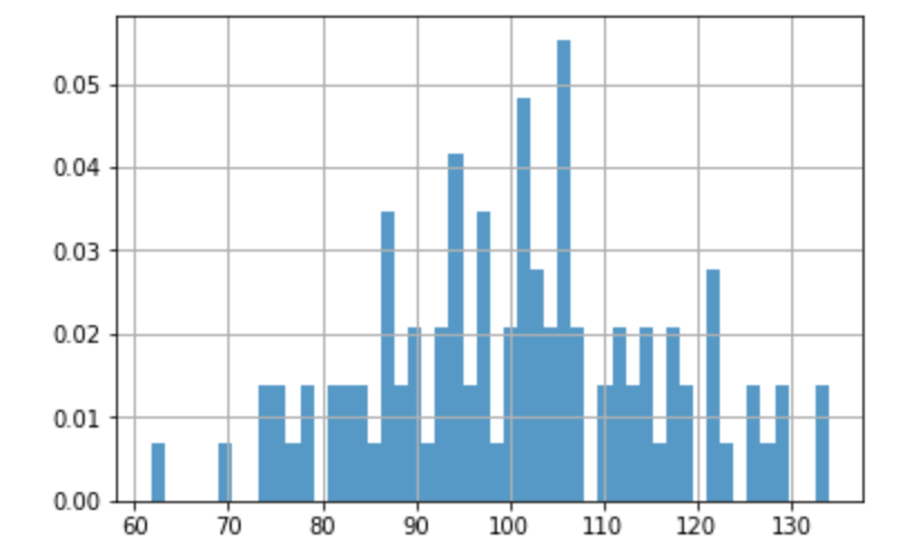
極座標グラフ(polar)にグリッドを表示 するには rgrids 関数を使います。
1from matplotlib import pyplot as plt
2import numpy as np
3
4plt.polar()
5plt.rgrids((0.25, 0.5, 1.0))
6plt.show()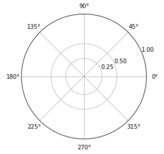
rgrids の代わりに thetagrids 関数で、グリッドとラベルを一緒に設定 することも可能です。
1from matplotlib import pyplot as plt
2import numpy as np
3
4plt.polar()
5plt.thetagrids(range(45,360,90), ('NE', 'NW', 'SW','SE'))
6plt.show()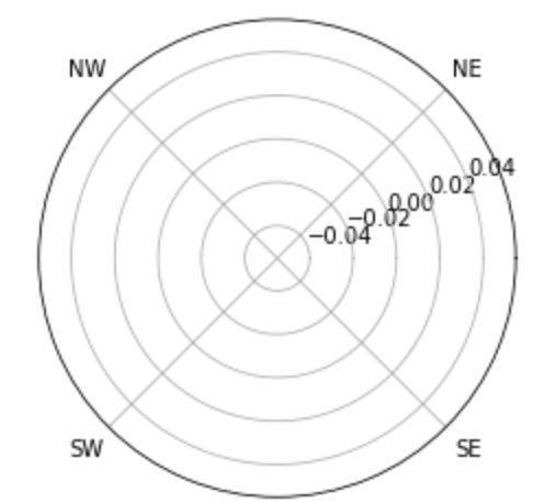
非構造三次元データ (tricontour) にグリッドを表示 するには triplot 関数を使います。
 1import matplotlib.pyplot as plt
 2import matplotlib.tri as mtri
 3import numpy as np
 4
 5x = np.asarray([0, 1, 2, 3, 0.5, 1.5, 2.5, 1, 2, 1.5])
 6y = np.asarray([0, 0, 0, 0, 1.0, 1.0, 1.0, 2, 2, 3.0])
 7triangles = [[0, 1, 4], [1, 2, 5], [2, 3, 6], [1, 5, 4], [2, 6, 5], [4, 5, 7],
 8             [5, 6, 8], [5, 8, 7], [7, 8, 9]]
 9triang = mtri.Triangulation(x, y, triangles)
10z = np.cos(1.5 * x) * np.cos(1.5 * y)
11
12plt.tricontourf(triang, z)
13plt.triplot(triang, 'ko-')
14plt.show()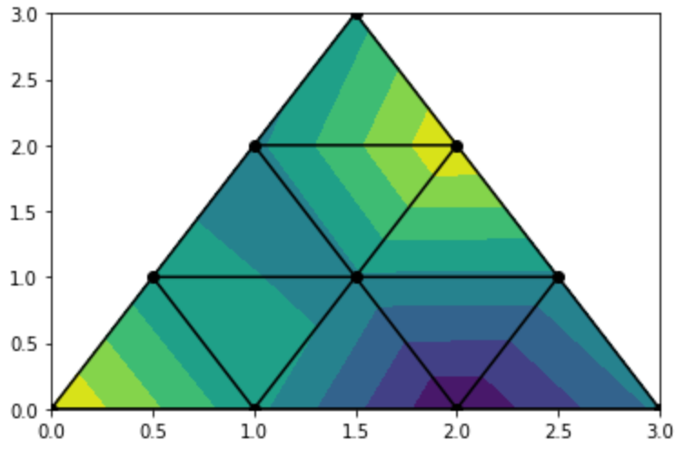
目盛りの分割数を変更:locator_params
指定軸の 目盛りの分割数 を指定できます。
nbins オプションは2の乗数で指定するといい感じにスケールしてくれます。
指定された数字通りに分割してくれるときとそうでないときがあり。
 1import numpy as np
 2import matplotlib.pyplot as plt
 3
 4np.random.seed(0)
 5
 6mu, sigma = 100, 15
 7x = mu + sigma * np.random.randn(100)
 8
 9plt.hist(x, 50, density=True, alpha=0.75)
10# x軸を8分割
11plt.locator_params(axis='x', nbins=8)
12plt.show()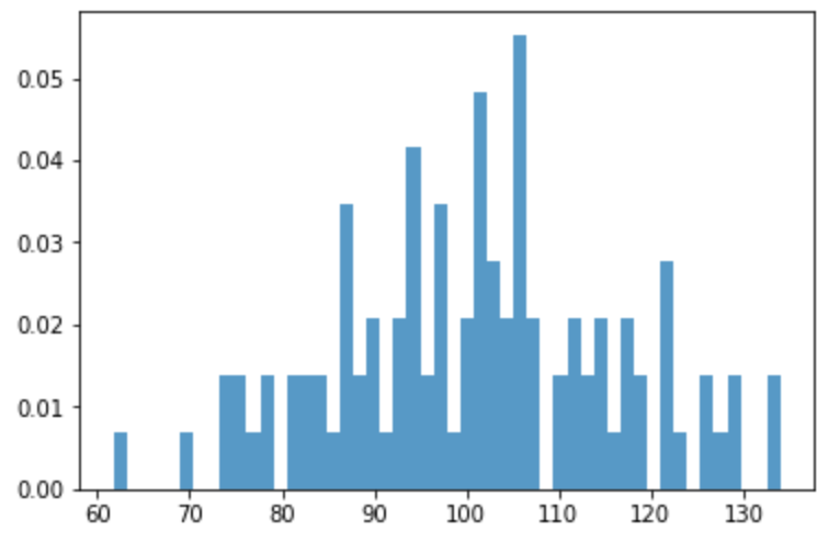
マージンの追加:margins/subplots_adjust
図内の点に対してマージンをとって、データを見やすい位置に調整します。
1import matplotlib.pyplot as plt
2
3x = [1, 2, 3, 4]
4y = [1, 4, 9, 6]
5
6plt.plot(x, y, 'o')
7plt.margins(0.3)
8plt.show()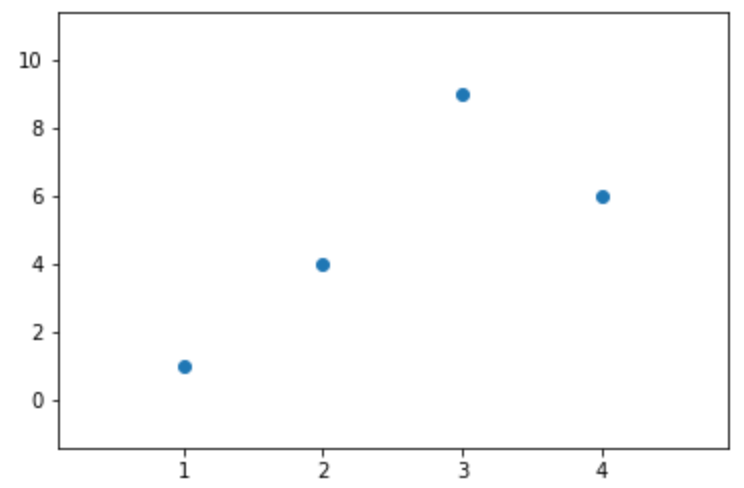
subplots を使った複数のグラフ描画の場合には subplots_adjust が使えます。
 1from matplotlib import pyplot as plt
 2import numpy as np
 3
 4np.random.seed(0)
 5
 6plt.subplot(211)
 7plt.imshow(np.random.random((100, 100)), cmap=plt.cm.BuPu_r)
 8plt.subplot(212)
 9plt.imshow(np.random.random((100, 100)), cmap=plt.cm.BuPu_r)
10
11plt.subplots_adjust(bottom=0.3, right=0.8, top=0.9)
12plt.show()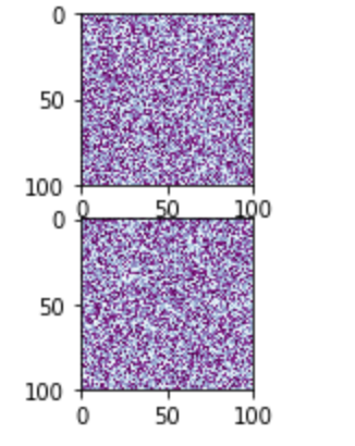
レイアウトの自動調整:tight_layout
複数グラフ間のレイアウト設定から、自動で調節してくれます。
 1from matplotlib import pyplot as plt
 2import itertools
 3
 4fontsizes = itertools.cycle([8, 16, 24, 32])
 5
 6def example_plot(ax):
 7    ax.plot([1, 2])
 8    ax.set_xlabel('x-label', fontsize=next(fontsizes))
 9    ax.set_ylabel('y-label', fontsize=next(fontsizes))
10    ax.set_title('Title', fontsize=next(fontsizes))
11
12fig, ((ax1, ax2), (ax3, ax4)) = plt.subplots(nrows=2, ncols=2)
13example_plot(ax1)
14example_plot(ax2)
15example_plot(ax3)
16example_plot(ax4)
17plt.tight_layout()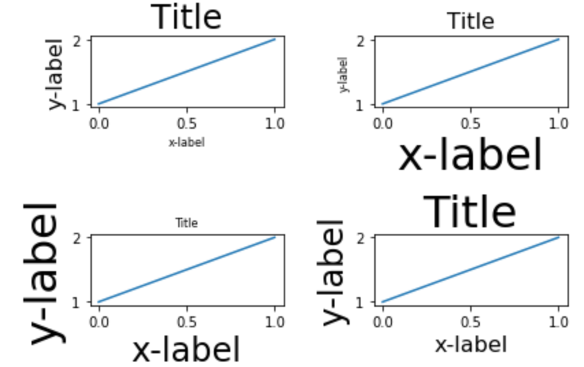
複数グラフの描画:subplots
複数のグラフを描画する場合には、 subplots を使います。
返却された axes 配列の要素にアクセスして、データをプロットする関数を実行することで描画が可能です。
 1from matplotlib import pyplot as plt
 2import numpy as np
 3
 4x = np.linspace(0, 2*np.pi, 400)
 5y = np.sin(x**2)
 6
 7fig, axes = plt.subplots(2, 1)
 8axes[0].plot(x, y)
 9axes[1].scatter(x, y)
10plt.show()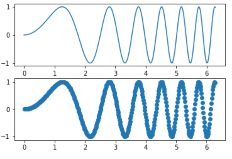
テイストを手書き風に変更:xkcd
グラフを手書き風にできます。
1import numpy as np
2from matplotlib import pyplot as plt
3
4plt.xkcd()
5
6x = np.linspace(-np.pi, np.pi, 100)
7plt.plot(x, np.sin(x),label="y = sinx")
8plt.show()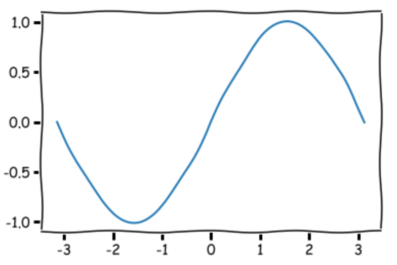
まとめ
matplotlibのAPI一覧からいろいろ試してみました。
API名からは用途のイメージがわかないものもあり、試してみて「へぇ、こんなのあるんだ」というのも多かったです。 また、指定オプションも多く組み込まれているので、一つのAPIでもデータの表現方法に幅が出ます。
通常利用する分には概ねの十分な範囲をカバーできていると考えています。